When the brand is the promise, the product is the proof.
I believe that the product experience should be the best expression of the brand; therefore, partnering with product, engineering, marketing, sales, and customer success teams is critical to ensure a consistent brand experience across all customer touch points and interactions. So how do you do this?
1. You need to know whom you’re designing for.
Sounds simple enough, but is often enough simple to forget. In his book, the author Eric Ries states:
“If we do not know who the customer is, we do not know what quality is.”
The Lean Startup
A modern definition of quality defines it as, “fitness for the intended use” (i.e. meeting or exceeding customer expectations). Quality is a perception that relates a person using a product to that product and is, therefore, not absolute, but relative. It follows that without knowing who our customers are, we cannot know their needs and can therefore neither meet nor exceed their expectations.
We must ask:
- Who is our customer/user?
- What problem are we trying to solve?
Where there is no quality, there is no value. Where there is no value, there will be no customer engagement (effort).
This simple truth leads to my second one…
2. Great design is an outcome of radical prioritization.
In my experience, products often fail when the teams build experiences without a clear understanding (or assumptions even) of who they are building for (see above). Only then, can you begin to make some decisions on the customer’s behalf. When you know what a person cares about and values, you can make better decisions about what to put in front of them.
When trying to cut through the clutter, I will ask my team to put things into three groups. I love the number three. When exploring any options, I will always ask for things in threes from my team. The next thing I’ll ask: prioritize the use cases. What do people need to do most often? Less often? Almost never? The answers to these questions will directly correlate to your design decisions.
- Things you do most often: Should be obvious in the UI. Likely persistent.
- Things you do less often: Should be easily accessible in the UI. Likely in a menu.
- Things you rarely do: Can be tucked away into settings (e.g. a menu).
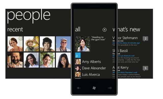
High-priority use cases are on the left, secondary in the middle, and tertiary on the right.
There are exceptions, of course, but those are often unique/conditional situations requiring other solutions (e.g. a first-run experience).
Exceptions bring me to my third (see? I do like threes) truth…
3. There is no one-size-fits-all design process.
There isn’t. Especially now in the age of vibe-coding and AI-enabled product development. I’ve always tried to treat “design thinking” or “big D design” or whatever the Design Process du jour is as a guideline rather than a strict template. This is where things sometimes go sideways.
The point here is to LEARN and let that learning inform the product and to do that as quickly and efficiently as possible.
I’ve been designing long enough to have seen many, many iterations of the ‘design process’ come in and out of vogue. At Frog, we had a 3-D process: Discover, Design, Deliver. IDEO had a triple-I process: Inspiration, Ideation, Implementation. Popular at the moment, is the Design Council’s “Double Diamond” 4-step variation:

In essence, you start with not knowing much about your task or problem. You move on to knowing enough to develop some educated guesses. From there, you can begin developing a solution that will ultimately get built. Along the way, there are phases of divergent and convergent thinking, there are interactions with users, there’s the validation of assumptions, there’s (a lot of) rework and finally, there’s a resolution. This is, more or less, the design process.
What about vibe-coding and AI?
Thanks to AI-enabled coding (aka vibe-coding), the Product Development process is changing… almost daily. More people can now do more things, regardless of the discipline they are in; “Role Collapse” is a term I’ve been hearing to describe this. I’m a proponent of leaving the old titles at the door, viewing them as strengths, and embracing “AI Builder” as a phrase to describe a person who is doing all jobs (though they may mostly be from one discipline).
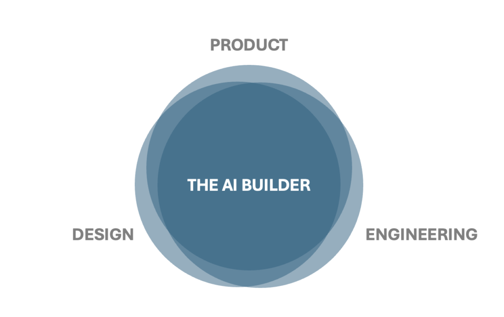
The process and steps are more or less the same, but they are less distributed across people and teams. There’s more iteration. In essence, there’s more overlap between phases of the Double Diamond. You can test things earlier and go back to make changes. You can also pull your MVP forward as a result.
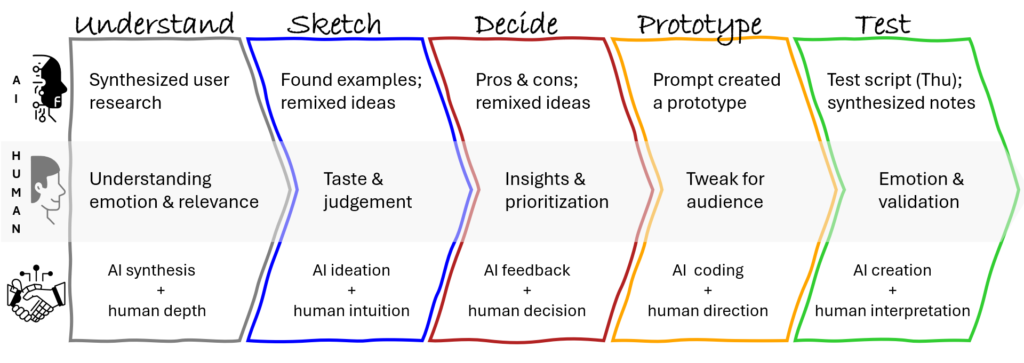
What this looks like:
I’ve been following this new process as I build PathPilot. Much of the real work happened through free-form, spoken dialogue, using voice mode to think out loud, challenge assumptions, and clarify intent in real time. I would start with a loose idea or problem, talk it through until the shape of it became clear, and then have that thinking distilled into a mini PRD. We wrote many of these. Each one captured a moment of clarity, a hypothesis about what mattered next, and an explicit set of tradeoffs. Those PRDs were not documentation for its own sake; they were thinking tools, used to slow the work down just enough to preserve coherence.
From there, the PRDs were translated into something buildable. I would break them into tightly scoped batches, organized by feature, function, UI, and data, so they could be executed cleanly in Lovable. Sometimes this was accompanied by a rough sketch or a quick screen mock, just enough to anchor the intent. Then the real vibe-coding began: building, testing, prompting, re-prompting, fixing, refactoring, and repeating. The back-and-forth between idea, implementation, and behavior in the system was constant. I was using the product while building it, noticing where it felt off, where language collapsed, where structure leaked, and then adjusting both the prompts and the product in tandem.
I chose Lovable deliberately because it let me stay in that loop. It removed the friction between concept and execution and made it possible to treat the product as a living system rather than a static build. I did not want tooling that forced premature rigidity or pushed me into false precision. I wanted something that supported exploration without sacrificing structure. That combination, free-form thinking up front, lightweight but explicit PRDs, and fast, iterative execution, is the same way I have designed teams and products for years. PathPilot is simply that process made visible, with AI as an active collaborator rather than a black box.
What about… MVPs?
I’m good with MVPs… as long as we are clear on what it is we want to learn and have a process for folding that learning into what we are building.
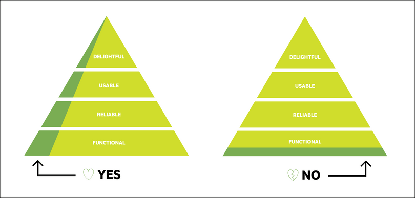
For me, it’s more about knowing when to use a certain tool or process, understanding the trade-offs when skipping a step of the process, tailoring methodology to where a company is at, and being able to strike a balance that propels the business forward while delivering a great product experience.
One more thing…
One of my core tenets is, “Early alignment and frequent refinement.” Getting on and staying on the same page is crucial to collaboration and avoiding friction and pitfalls within the team. This is especially true when you are talking about “how” you are going to do the work, how you are going to stay aligned, and how you will know when you are done.
The Tools of the Trade
Having said all this, here are some of the skills I am experienced in (by phase):
Discover
- market research
- user research
- competitive analysis
- value proposition development
Design
- personas
- empathy maps
- user flows
- design principles
- information architecture
- wireframes
- visual mockups
- prototyping
Deliver
- assets (graphics, bitmaps, 9-patch)
- visual QA
- functional specifications
- style guides
Deploy
- usability studies
- bug testing
- A/B testing
- HTML audits
- Champagne bottle opening
Keywords: Approach, Design, Process, Product Design, Philosophy
